7 tactics/strategies to Make Your Website AI-Search-Ready in 2025

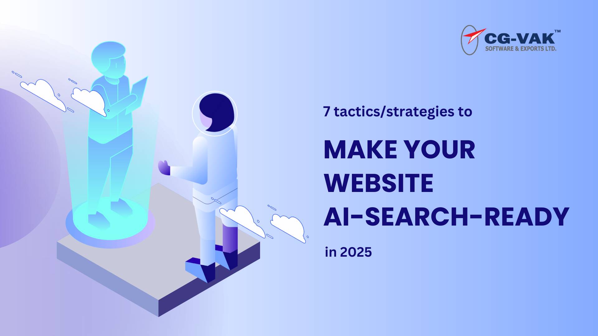
In the ever-evolving digital landscape, artificial intelligence has become a game-changer for search engine optimization. As AI-powered algorithms grow more sophisticated, they’re no longer just matching keywords but interpreting user intent and content relevance. This shift demands a new approach to online visibility. Websites that fail to adapt risk losing traffic and potential customers.

To thrive in this AI-dominated era, businesses must embrace innovative strategies that align with these intelligent algorithms. This article explores seven key tactics to fortify your website against AI-driven search, ensuring you stay ahead in the digital race and continue to attract valuable traffic.

1. Optimize for Semantic Search

Semantic search represents a significant leap in how search engines understand and interpret user queries. It focuses on the meaning behind the search rather than just matching exact phrases. AI-powered algorithms analyze various factors, including user location, search history, and global search patterns, to deliver more relevant results.

For website owners and content creators, this shift means moving beyond simple keyword optimization to creating comprehensive, context-rich content that addresses user intent and provides valuable information.

Actions to Take:

  • Use structured data and schema markup: Implement structured data using schema.org vocabulary to provide search engines with explicit information about your content. This helps AI-powered SEO analytics tools understand the context and relationships within your website, improving visibility in semantic search results. Focus on key schema types like Organization, LocalBusiness, Product, and Article.
  • Focus on creating content that answers specific user queries: Develop comprehensive, in-depth content that directly addresses user intent and questions. Use tools like Answer the Public or Google’s “People Also Ask” feature to identify common queries in your niche. Structure your content with clear headings, bullet points, and concise paragraphs for easy information extraction.
  • Implement natural language processing (NLP) techniques: Utilize NLP principles in your content creation process to align with how AI interprets language. Use synonyms, related terms, and contextually relevant phrases throughout your content. Employ tools like Google’s Natural Language API or SEMrush’s SEO Writing Assistant to optimize content for better semantic understanding.

2. Enhance User Experience (UX) with AI Insights

Leverage AI-powered analytics tools to analyze user behavior and improve UX. Implement personalized content recommendations based on user preferences and browsing history. Use AI to optimize website navigation by analyzing user flow and identifying pain points, creating a more intuitive and engaging user experience.

Actions to Take:

  • Implement advanced platforms like Google Analytics 4 or Adobe Analytics: These use machine learning to provide deeper insights into user behavior, identify patterns, and predict actions for UX improvement.
  • Implement personalized AI content strategies: Use AI algorithms to analyze user behavior and preferences, then deliver tailored content suggestions. Create dynamic content blocks that adapt based on user interests, browsing history, and demographic information.
  • Improve website navigation based on user interaction data:
    Employ AI to analyze user flow and identify navigation pain points. Use machine learning to dynamically adjust menu structures, suggest related content, and highlight popular pages based on real-time user data.

3. Leverage AI for Content Creation and Optimization

AI is revolutionizing content creation, optimization, and distribution. Advanced natural language processing algorithms can analyze top-performing content, identify trends, and even assist in generating content ideas. AI tools can optimize existing content by suggesting improvements in readability, structure, and SEO. By incorporating AI into your content workflow, you can produce more relevant, engaging, and search-engine-friendly content at scale.

Actions to Take:

  • Use AI tools for content generation and editing: Employ AI-powered writing assistants like GPT-3-based tools or Jasper.ai to generate initial drafts, outlines, or creative ideas. Use AI editing tools like Grammarly or ProWritingAid to refine content for grammar, style, and readability.
  • Employ AI for keyword research and content suggestions:
    Utilize AI-driven SEO tools like SEMrush’s Topic Research or MarketMuse to identify trending topics, uncover content gaps, and generate data-driven content ideas. Analyze competitor content to identify opportunities for creating more comprehensive resources.
  • Optimize content readability and engagement with AI:
    Implement AI-powered content optimization tools like Clearscope or Frase to ensure content meets user intent and covers relevant subtopics. Use AI readability analyzers to adjust complexity and tone for better accessibility and engagement.

4. Implement AI-Powered Chatbots for Enhanced Engagement

AI-powered chatbots have emerged as a powerful tool for improving user engagement and providing instant support. These intelligent virtual assistants can handle a wide range of customer inquiries, provide personalized recommendations, and even assist with transactions. Implementing chatbots can significantly enhance user experience by providing 24/7 support, reducing wait times, and offering instant access to information, indirectly boosting search rankings.

Actions to Take:

  • Integrate AI chatbots for real-time support: Implement sophisticated AI chatbots using platforms like Dialogflow or IBM Watson for instant, 24/7 customer support. Train chatbots with comprehensive FAQs and common queries, ensuring seamless handover to human agents for complex issues when necessary.
  • Use chatbots to gather user feedback and preferences: Design AI chatbots to proactively engage users and collect valuable feedback through short surveys or casual conversations. Use natural language processing to analyze responses, identify trends, and gauge user satisfaction in real-time for continuous improvement.
  • Personalize chatbot interactions based on user data: Integrate chatbots with CRM and analytics platforms to access user data for tailored interactions. Program chatbots to remember past conversations, user preferences, and browsing history, offering personalized product recommendations, content suggestions, or support for enhanced user experience.

5. Adopt AI for Advanced SEO Analytics

AI is transforming SEO analytics, offering deeper insights and more accurate predictions. Machine learning algorithms can process vast amounts of data to identify patterns and trends that would be impossible for humans to discern manually. These AI-powered analytics tools can predict future search trends, identify emerging keywords, and even anticipate algorithm updates, helping businesses make data-driven decisions and stay ahead of the competition.

Actions to Take:

  • Use AI tools for predictive analytics and trend forecasting: Implement AI-powered SEO tools like BrightEdge or Conductor to analyze historical data and predict future trends. Use these insights to anticipate shifts in search behavior, identify emerging keywords, and forecast potential impacts of SEO strategies.
  • Employ AI for competitor analysis and benchmarking: Utilize AI-driven competitive intelligence tools like Crayon or Kompyte to automatically monitor and analyze competitors’ online activities. Track changes in their websites, content strategies, and search rankings to identify gaps and opportunities for differentiation.
  • Integrate AI-driven reporting tools for better insights: Implement AI-powered reporting solutions like Databox or Looker to aggregate data from multiple sources and generate insightful reports. Set up automated alerts for significant changes in key metrics, allowing quick responses to SEO performance challenges and opportunities.

6. Optimize for Voice Search and AI Assistants

The rise of voice-activated devices and AI assistants has significantly impacted search behavior. Voice searches tend to be longer, more conversational, and often in the form of questions. This shift requires a different approach to content creation and optimization, focusing on natural language patterns and providing direct answers to common queries. Websites that adapt their SEO strategies to this trend will have a significant advantage in capturing this growing segment of search traffic.

Actions to Take:

  • Optimize content for voice search queries: Restructure content to align with natural speech patterns and long-tail conversational queries. Create concise, direct answers to common questions in your niche. Implement FAQ sections using schema markup to increase chances of being featured in voice search results.
  • Use conversational keywords and natural language: Conduct keyword research targeting conversational phrases and question-based queries. Use tools like Answer the Public to identify common voice search queries. Incorporate these conversational keywords naturally into content, headings, and meta descriptions to mimic dialogue patterns.
  • Implement structured data to enhance voice search visibility: Utilize schema markup to provide clear, structured information about content, products, or services. Focus on schemas relevant to voice search, such as FAQPage, HowTo, and LocalBusiness. Implement speakable schema markup to indicate sections suitable for text-to-speech applications.

7. Ensure Mobile Optimization with AI-Driven Tools

With mobile devices accounting for a majority of web traffic, mobile optimization is crucial. AI-driven tools are making it easier to create seamless mobile experiences by automatically adjusting layouts, optimizing images, and even predicting user behavior to preload content. AI can analyze user interactions on mobile devices to identify pain points and suggest improvements, significantly impacting search rankings and overall digital performance.

Actions to Take:

  • Use AI tools to test and improve mobile usability: AI tools can analyze user interactions and behaviors on mobile devices, providing insights into usability issues. By employing machine learning algorithms, these tools identify patterns and suggest improvements, enabling designers to create more intuitive interfaces that enhance user experience and satisfaction.
  • Implement adaptive design strategies: Adaptive design strategies involve creating multiple layouts tailored to different screen sizes and resolutions. This approach ensures that content is displayed optimally across devices, improving accessibility and engagement. By prioritizing user context, adaptive design enhances usability, leading to higher retention and conversion rates.
  • Optimize site speed and performance for mobile devices: Optimizing site speed is crucial for mobile users, as slow-loading pages lead to high bounce rates. Techniques include compressing images, minimizing scripts, and leveraging browser caching. A fast, responsive site enhances user satisfaction, encourages exploration, and ultimately drives conversions and brand loyalty.

Conclusion

Incorporating AI-driven techniques into your SEO strategy is essential for staying competitive in today’s digital landscape. From enhancing user experience with AI-powered insights to optimizing for voice search SEO tactics and leveraging AI ML services for advanced analytics, these strategies ensure your business remains at the forefront of the evolving search engine optimization landscape.

Adopting AI influencing search results will help your website attract valuable traffic and maintain a strong digital presence. By embracing artificial intelligence and integrating these personalized AI content strategies, businesses can drive growth, improve user engagement, and maximize online visibility with the help of our advanced digital marketing services and website development services.

Tailwind CSS Vs Bootstrap: Decoding the Best Framework for Your Project

CSS frameworks have become essential tools for creating polished, responsive interfaces. Two titans in this arena, Tailwind CSS framework and Bootstrap, consistently dominate developer discussions, sparking debates about their merits and use cases.

As new frameworks emerge, developers naturally question if they offer advantages over existing solutions. This curiosity fuels the ongoing comparison between Bootstrap, a long-standing pillar in the CSS framework landscape, and Tailwind, a rising star with a fresh approach to styling.

Developers engaged in front-end development are eager to understand the key differences and similarities between these frameworks. They want to know which one might be “better” for their specific needs and how each impacts development workflows.

This exploration aims to demystify the Tailwind vs. Bootstrap debate. In this article, we’ll examine their core philosophies, feature sets, and practical applications. By comparing one of the most established CSS frameworks with an innovative newcomer, we’ll provide insights to help developers make informed decisions for their projects.

Whether you’re a seasoned professional or a newcomer to web development, understanding the strengths and weaknesses of Tailwind and Bootstrap is crucial in today’s fast-paced development environment. Let’s dive into this comparison and uncover which framework might be the best fit for your next project.

What is Bootstrap?

Bootstrap is a pioneering CSS framework, developed and open-sourced by Twitter in 2011. Its enduring popularity stems from its comprehensive approach to front end web design, offering pre-built components and responsive, mobile-first templates.

At its core, Bootstrap provides a robust set of CSS classes that developers can easily apply to HTML elements. These classes encapsulate complex styling and behavior, simplifying the process of creating common web components like navigation bars, buttons, and forms.

A key feature of Bootstrap is its dropdown system. By applying classes like dropdown-menu to a container and dropdown-item to its children, developers can quickly create fully-styled dropdown menus without writing custom CSS.

Bootstrap’s strength lies in its ability to streamline development, especially for projects requiring rapid prototyping or consistent, professional-looking interfaces. It’s particularly beneficial for developers who need to create responsive designs efficiently, as Bootstrap’s grid system and component library are built with mobile-first principles in mind, similar to the tailwind responsive approach.

What is Tailwind CSS?

Tailwind CSS, created in 2017 by Adam Wathan and Steve Schoger, represents a paradigm shift in front end website development. Unlike traditional CSS frameworks, Tailwind adopts a utility-first approach, providing developers with a comprehensive set of low-level utility classes. These classes serve as building blocks, allowing for highly customizable and precise design implementation directly in the HTML.

The framework’s core philosophy revolves around flexibility and efficiency. By offering a vast array of pre-defined classes for common CSS properties, Tailwind enables rapid prototyping and development. Developers can style elements inline, reducing the need for custom CSS and promoting a more intuitive design process.

Key Features of Tailwind CSS include:

  1. Extensive customization options: Tailwind’s configuration file allows developers to tailor the framework to their project’s specific needs. This includes defining custom color palettes, breakpoints, spacing scales, and more, ensuring a perfect fit for any design system.
  2. Built-in responsiveness: With mobile-first principles at its core, Tailwind offers responsive utility classes that make it easy to create adaptive layouts. Developers can effortlessly adjust styles across different screen sizes using intuitive prefixes like ‘sm:’, ‘md:’, and ‘lg:’.
  3. JIT (Just-In-Time) compiler: This feature dynamically generates styles based on the utility classes used in your markup. It significantly reduces build times and file sizes by only including the CSS you actually use in your project.
  4. PurgeCSS integration: Tailwind automatically removes unused styles from your production build, resulting in significantly smaller CSS files. This optimization enhances website performance by reducing load times and bandwidth usage.
  5. Seamless framework integration: Tailwind works harmoniously with popular JavaScript frameworks like React, Vue, and Angular. Its utility classes can be easily applied within component-based architectures, enhancing development workflow across different tech stacks.

Benefits of Tailwind CSS

  • It particularly shines in its ability to maintain consistency across large projects while still offering granular control over design elements. Its utility classes cover everything from layout and typography to color schemes and animations, providing a comprehensive toolkit for modern web design.
  • Tailwind CSS offers numerous advantages that have contributed to its rapid adoption in the front-end development community:
  • Rapid Development: Tailwind’s utility-first approach allows developers to quickly build custom designs without leaving their HTML. This significantly speeds up the development process, especially for prototyping and iterative design.
  • Flexibility and Customization: The framework provides unparalleled flexibility, allowing developers to create unique designs without fighting against pre-existing styles. Its extensive configuration options enable tailoring to specific project needs.
  • Consistent Design System: Tailwind enforces a consistent design language across projects, making it easier to maintain visual coherence in large-scale applications.
  • Responsive Design Made Easy: Built-in responsive utility classes simplify the creation of mobile-first, adaptive layouts.
  • Reduced CSS Bloat: With its PurgeCSS integration, Tailwind automatically removes unused styles, resulting in smaller file sizes and improved performance.
  • Enhanced Collaboration: The utility-first approach makes it easier for designers and developers to collaborate, as the design is directly reflected in the HTML.
  • Learning Curve to Mastery: While initial learning might be steep, once mastered, Tailwind significantly enhances productivity and code maintainability.
  • Community and Ecosystem: A growing community provides extensive resources, plugins, and tools, enriching the development experience.
  • Framework Agnostic: Tailwind works seamlessly with various JavaScript frameworks and static site generators, offering versatility across different tech stacks.
  • Performance Optimization: Features like the JIT compiler contribute to optimized builds and faster load times.

How easy it is to create unique designs with each framework

Bootstrap provides pre-designed components, making it easy to create professional-looking sites quickly. However, achieving truly unique designs can be challenging. Customization often requires overriding default styles, which can be time-consuming and may lead to increased CSS complexity.

Tailwind’s utility-first approach offers greater flexibility for unique designs. Its low-level utility classes act as building blocks, allowing developers to construct custom layouts and styles directly in HTML. This approach enables rapid prototyping and easier implementation of bespoke designs. While it requires more upfront decision-making, Tailwind ultimately provides more control and facilitates the creation of distinctive, tailored interfaces without fighting against pre-existing styles.

How will be maintainability of codebases using Tailwind vs. Bootstrap in large projects

Maintainability in large projects differs significantly between Tailwind and Bootstrap. Bootstrap’s component-based approach can lead to more consistent, easily recognizable patterns across a large codebase. However, as projects grow, developers often need to override Bootstrap’s default styles, resulting in additional CSS that can become challenging to manage. This can lead to specificity issues and increased CSS complexity over time.

Tailwind’s utility-first approach initially results in more verbose HTML, which some developers find less readable. However, it significantly reduces the need for custom CSS, leading to smaller stylesheets and fewer specificity conflicts.

As projects scale, Tailwind’s approach often results in more maintainable codebases because changes are localized to components, reducing unintended side effects. The consistent utility classes create a shared vocabulary among developers, and the purge feature keeps CSS lean, even as the project grows.

Ultimately, while both frameworks can be maintained effectively, Tailwind often provides better long-term maintainability in large projects due to its scalable nature and reduced CSS complexity.

Strategies To Optimize Performance with Tailwind And Bootstrap

Optimizing Bootstrap and Tailwind CSS for large front end website development projects involves several strategies applicable to both frameworks. For Bootstrap, consider using its customization options to include only necessary components, reducing the overall file size.

Utilize Bootstrap’s built-in Sass variables and mixings to create a more tailored design system. For Tailwind, leverage its configuration file to remove unused utilities and customize the framework to fit project needs, especially when creating tailwind responsive designs.

Both frameworks benefit from tree-shaking and minification techniques in front end web design. Implement critical CSS extraction to improve initial load times. Use CSS purging tools to eliminate unused styles, significantly reducing file sizes. Employ lazy loading for non-critical CSS and leverage browser caching for better performance.

Consider modularizing your CSS by breaking it into smaller, more manageable files. Implement a consistent naming convention (like BEM) for custom classes. Regularly audit your stylesheets to remove redundant or outdated code. Finally, use performance monitoring tools to identify and address CSS-related bottlenecks in your application, ensuring optimal performance in responsive layouts across various devices.

Bootstrap vs Tailwind CSS: Key Differences

Understanding their key differences is crucial for front end developers to make informed decisions based on project requirements.

  • Philosophy: Bootstrap adheres to a component-based methodology, offering pre-designed UI elements that developers can readily implement. This approach promotes rapid development and consistency across projects. In contrast, Tailwind CSS embraces a utility-first philosophy, providing a vast array of low-level utility classes. This empowers developers to construct custom designs directly within their HTML, offering greater flexibility and control over the final output in front end web design.
  • Learning Curve: Bootstrap generally presents a gentler learning curve, particularly for beginners in front end website development. Its pre-built components and familiar class naming conventions make it relatively easy to grasp and implement quickly. Tailwind CSS, while powerful, initially demands more from developers. Its extensive set of utility classes requires time to master, but once familiar, it can significantly accelerate the development process.
  • Customization and Design Flexibility: Tailwind CSS excels in customization, offering unparalleled flexibility through its comprehensive configuration file. This is particularly evident when creating tailwind responsive designs, allowing developers to easily tailor the framework to match specific design requirements. Bootstrap, while customizable, often requires overriding default styles to achieve distinct designs, which can lead to increased CSS complexity.
  • File Size and Performance: Bootstrap’s comprehensive component library typically results in larger file sizes, which can impact load times if not optimized. Tailwind CSS, especially when leveraging its purge feature to remove unused styles, can produce significantly smaller file sizes. This aspect is crucial in front end web design where performance is a key consideration.
  • Responsive Design: Both frameworks excel in creating responsive layouts, but their approaches differ. Bootstrap relies on its tried-and-true grid system and responsive utilities. Tailwind CSS offers a more flexible approach with tailwind responsive utility classes that can be applied directly in HTML, allowing for more granular control over element behavior across different screen sizes.
  • Community and Ecosystem: Bootstrap boasts a larger, more established community and ecosystem, with a wealth of third-party themes and plugins available. Tailwind CSS, while newer, has a rapidly growing community and an increasing number of resources, tools, and extensions. This evolving ecosystem is particularly beneficial for those offering front end developer services.
  • Integration with Modern Development Practices: Tailwind CSS’s utility-first approach often integrates more seamlessly with component-based architectures common in modern JavaScript frameworks. Its classes can be easily applied within components, promoting a more modular and maintainable codebase. This is particularly advantageous for complex front end website development projects.

Conclusion

Both Tailwind CSS and Bootstrap are popular CSS frameworks, each offering distinct advantages and drawbacks. Tailwind adopts a utility-first approach, providing enhanced flexibility and customization options, but it may present a steeper learning curve for newcomers. If you’re looking for a visually appealing user interface for your project, hiring a Tailwind CSS developer could be beneficial.

Conversely, Bootstrap features a comprehensive array of pre-designed components, making it easier to start projects quickly, although it may lack the versatility needed for highly customized designs. Ultimately, the choice between Tailwind CSS and Bootstrap hinges on your specific project requirements, web development style, and familiarity with the frameworks.